Monday, May 17, 2010


In this design, I was hoping to show my love of the beach through pictures and audio. I wanted to show exactly how passionate I am on the subject.
I made the general decision of making my subject of the final project beaches easily. The ocean has always been a big part of my life because my family and I would spend most of our time durning the summer and sometimes even during the winter there. The decision of picture choice was a little more difficult I wanted to pick beaches I had actually been on and things that I have done. (such as sailing, surfing, snorkeling, parasailing)
The most challenging part of this project was just figuring out how to post the final project.
I tried both filezilla and WBng countless times. I then even resorted to making a powerpoint of the presentation, but halfway through I knew it was to informal and sloppy to put up on the blog. I ended importing my saved audio and picture file to iMovie and did the same thing you would in soundslides.
Im most proud of the audio in my final project. I first cut the Bob Marley song to prevent copy right policies, then added my voice and the beach sounds in the background. It was difficult at first but I think the end result came out well.
If I had more time with this project I probably would have re-recorded my voice to make it sound more clear for the final copy.

Monday, May 10, 2010

in Design In Design
Quark

In this project for the Bind and Blow in Cards, I was hoping to create the best replica of the card I had chosen in both Quark and In Design. I knew that I wouldn't be able to get EXACT replicas of the cards but I would try my best.
The hardest decisions in this project would be the font types. You obviously don't know the exact fonts the manufacturers but i ended up deciding on using mainly Arial font because it looked the closest. Another decision I had to make was whether or not I wanted to make the back of the card on In Design or Quark. I figured I would make the fronts first and then decide based on whichever one I was more comfortable. In the end I chose in Design and I think the back came out really well.
What was extremely challenging was the graphics on the front of my cards. The brand name "muscle car review" was not on the internet so I had to cut, paste, and edit the letters to fit the appropriate colors and sizes. It was difficult but in the end came out pretty well. Another challenge was the mixed up fonts. It was clear after carefully observing the real card that there were several different fonts used. The problem was all the fonts were very similar. I went through over 100 different fonts to try and find the ones the companies used but in the end I was happy how they came out.
Solving the problems with the fonts was tedious but fairly simple, searching through all the normal looking fonts the computer had to offer.
I was most proud of the front of the card I made on In Design. I think it looked very similar to the real card and even though making all those lines and placing them took a very long time the final product was definitely worth it.
Overall I prefer using InDesign rather than Quark. Quark for me was almost too simple and not in depth enough. I always had to search and see how to simple tasks like changing colors. In Design has more options and was more like photoshop, which is expected seeing as they are made from the same company. I will stick with CS in the future.


Thursday, May 6, 2010

Thursday, April 22, 2010


In this particular project, I was hoping to achieve an exciting brochure for the New England Aquarium. I wanted to it be bright and informative, providing all the information someone would want to know about the aquarium and make it as appealing as possible.
Jess and I decided we wanted to keep the color scheme blue and white, naturally to represent the ocean and water in general. We also decided together we wanted to fill the brochure with some of the amazing pictures NEAQ had to offer.
Once again, learning a new program (inDesign) was a struggle at first but once I got used to it it was easy to breeze through the project. Another hard part of the project was picking the information that the brochure reader would need, and leaving the unimportant things out due to the lack of space.
To solve the information problem we looked at the website and found out what was most important to the New England Aquarium. What they feel is vital to add to their homepage we felt would probably be useful in the brochure, like their exhibits and hours.
I was definitely most proud of the collages (two on the middle page, and the cover) I made on photoshop. I think they came out exactly how I had wanted them to be; showing high resolution pictures of all the different exciting things someone can find at the New England Aquarium.
If I had more time I would probably find time to condense the inside of the brochure (the side I made) because I used a lot of information. I could probably have read through it again and shortened them.


Thursday, April 8, 2010

Wiz Kahlifa Poster


• What were you trying to accomplish with your design decisions?
In this particular project, I was trying to convey a new modern rap artist (Wiz Kahlifa) and make a modern concert poster just like the artist.
• What challenges and problems did you encountered and how did you solved them?
Quark was definitely and interesting program that was extremely difficult for me to get used to after using photoshop. Everything seemed much more complex than it should be. For example, the side column stating the time and date of the concert couldn't go any further to the right for reasons I'm not so sure of. Also, I was trying to make the a red outline with black on the inside, however using the outline feature only makes it white on the inside of the font. I read the quark book to see if I could change this but it didn't have anything related to it.
• What was new for you?
The whole system of quark
• What did you enjoy most about the project?
I really enjoyed cropping the picture of the artist. I think it looks very unique with the white background and I found the perfect pose after looking for hours. I really enjoy that he is looking up at his name, I think it gives the poster a very unique feel.
• What are you most proud of in relation to this assignment?
I'm proud of mainly the picture, and the part of the poster with the name (Wiz Kahlifa) and the background image I made with the line tool in quark. I think I used a part of Quark with the line tool in a way that most people wouldn't think of.
• What could you have done had you had more time?
If I had more time I would create a boarder around the whole poster, because it is white and needs something to identify it from the background of blogger. Also, I would try and fill in the empty white space in the bottom left side of the poster.

Monday, March 29, 2010

Sublime Powerpoint

Sublime

In this particular project I was trying to portray a band from the 90's in a power point.
This particular project didn't face me with too many challenges due to the fact that I was already pretty comfortable with Power Point. The most difficult probably was just getting the timings right with slides and the music. I think, however, with a lot of practice I finally timed it well.
The only thing new to me in Power Point was actually picking the times you want your pictures and text boxes to come on the screen.
I really enjoyed the fact that I could pick a band that I have always had a great passion for. Even though I knew it would be hard to make the band look very professional (mainly because they aren't from the 2000's and they didn't have any high resolution photos on the internet) I still think I did a decent job making Sublime look good on the Power Point
I was definitely most proud of the music I made and how it relates to the Power Point. It took a long time to make the song sound like it is actually 60 seconds long, and it also took a very long time to make the timing at the ending coincide with the picture. I know in the end that to myself it came out exactly how I wanted to.
If I had more time I probably would have improved the chart because I know it was a little different than the rest of the slides.
• What were you trying to accomplish with your design decisions?
• What challenges and problems did you encountered and how did you solved them?
• What was new for you?
• What did you enjoy most about the project?
• What are you most proud of in relation to this assignment?
• What could you have done had you had more time?

Thursday, March 4, 2010

Design Rationale Animation Poem

Font Poem

-In this design, I really wanted to get out the true meaning of the poem in visuals. I wanted each word to stick out in its own unique way and for the animations to come together well with the collage.
-For each word, (or sometimes set of words) I gave them their own unique animation. The word believe was supposed to stick out the most and I made it slowly glow and begin to be on the page. The word 'dreams' on the other hand almost floats into its position, somewhat like an actual dream. Future comes from above, to represent how the future is ahead of you. Each animation corresponds with its the different words. The collage also has its own uniqueness. Each picture is of someone who is very inspirational and has once followed their dreams to do something important in life. (For example: Rosa Parks, Neil Armstrong, Walt Disney) and they are all multiplied so that they mesh with the background. If you look close enough the background is actually a watercolor work of a path, to represent following your path to fulfill your dreams.
-What I found most challenging in this project was figure out how to get the animations to be unique find out how to actually do them.
- To solve this problem I actually found an online tutorial on how to do animations in photoshop. It was helpful and I feel like my font poem will be very unique.
-I'm most proud of how the animations of each font came out in the end. At the beginning of the project I thought it would take forever and it wouldn't even be worth it but I kept at it and eventually made a piece I was proud of.
- If I had more time I definitely would have made a few changes in my collage. Figured out how to do different, unique things with each individuals picture rather than doing the same thing to all of them.

Monday, March 1, 2010


Contact Sheet Rational:

In the first Row, we discovered the different resolutions in photoshop. In the first box, the resolution was fairly low, only 72 DPI. You can tell that it is poor quality because the picture is obviously much more blurry than the others. As I moved up and changed it to 300 dpi, it became more clear, as with the next increase at 600 dpi. Finally the clearest picture was the resolution at 1200 dpi. I learned changing the resolution of pictures can greatly change the quality in any work you do on photoshop.

In the second row, I tested formats/modes. It's clear that the first picture is black and white. It gives the butterfly a very elegant look to it. The next picture is duo tone, where you pick a few colors and it makes almost a hue of these colors and can drastically add effect to the final outcome of a picture. For example the butterfly was changed to a very greyish red orange and almost makes the image appear to be old. In the third box is the normal picture that would appear on the internet in RGB (Red, Green, Blue). It looks very normal and is the general standard for photoshop. Finally in the last picture is CYMK color, which is basically like the secondary colors in photoshop. The butterfly appears very bright and colorful. For the picture of the butterfly it deffinetly adds the most appeal to the eyes.

In the third row on the contact sheet, I played around with Orientation. The box closest to the right is the regular landscape from a picture I retrieved on google. It is rectangle and the lengths on the bottom and top are much larger than that on the sides. In the middle box, I cropped the image to form a perfect square. Each side is the same length. Then in the first box on the left i cropped the image to create a portrait, which is the opposite of the landscape. In this image, the length of the two sides is longer than that of the length of the bottom and top. Each picture has its own unique quality and should be used according to what focus of the picture is.

In the fourth row, I tested Framing out on photoshop. The first picture is obviously on the right and is of a small buliding with a cocola sign to the right. As the pictures move to the left I frame each of them and without changing the size of the image, I keep zooming in until it is eventually only on a large picture of the cocola sign. The images are not tampered with or stretched in any way, they are simply zoomed in on a particular item in the photo.

In the fifth row, I used framing again to play with the content in a photo. I started off with the picture of the windmill on the right. Each picture to the left is framed to be more zoomed in than the last. Finally on the left picture it is so zoomed in that you can't even tell what the image actually is. It looks more like a fence than a windmill.

Finally in the 6th row, I used different filters to create different purposes for each image. I used a picture of the joker from Batman. The First picture (starting from the left I used a neo glow filter and made the color purple becasue the joker was always related to purple and green colors. It give the image a very eerie look and also goes well with the white makeup on his face. The next image I used a water paper filter, which may not be very joker-esqu but it deffinetly was a unique effect to play around with. It makes the picture obviously much more blurry but it also gives in a somewhat glossy effect and makes the colors lighter and brighter too. The next image I used "Ink Outlines" filter. It added darker inky looking lines and deffinetly made every dark feature in the joker stand out even more. The final image was just the one I started out with, or the journalistic view of the joker.

Thursday, February 25, 2010

Thursday, February 11, 2010


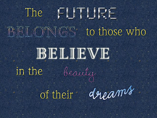
- I chose this particular quote, not only because it is by Eleanor Roosevelt who is was a strong, powerful woman in society, but also because it can inspire todays society to be creative and do something important for world that makes a difference.
- For the fonts, I kept the words that weren't as important as yellow because it went well with the background and helped the more important words to stick out. I wanted to make the word future look very, well, futuristic. I embossed it and almost made it look chrome-like. Belongs was a little more difficult because you can't really describe what "belongs" looks like, but I made it almost a rainbow like scheme because each color in the rainbow belongs together and fits well. I wanted the world 'believe' to have almost a god-like appearance so I put an outer glow and left the color and extremely light yellow. The beauty I really wanted to look girly and made it bright pink and very cuvy. I also made it shiny so it looked as if it was very done up. The word 'dreams' waw inteded to almost look like the clouds, very wavy and light colored.
- What I found most challenging about this project was deffinetly just getting used to photoshop. I've always had a creative spark but I never actually used the program before. It turned out to be a long process but it was actually fun because I got to play around with all different colors, backgrounds, and fonts.
-Becuase my main problem was actually learning how to use the software the only way I could fix it was to actually take the time to play around with all the different effects until I found something that I liked
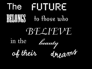
-I'm deffiently most proud of the actual final project in general. If you look at the difference between my first black and white draft and my final draft they are much different and for the better. I worked hard on the final colored copy and I feel like I did the best I could with the knowledge I had.
-If I had more time I probably would have just worked around with the colors to make it so they worked better together. They don't exactly match and work as a whole even though they still each have their own individual reasoning.


Thursday, February 4, 2010