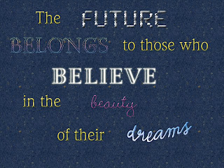
- I chose this particular quote, not only because it is by Eleanor Roosevelt who is was a strong, powerful woman in society, but also because it can inspire todays society to be creative and do something important for world that makes a difference.
- For the fonts, I kept the words that weren't as important as yellow because it went well with the background and helped the more important words to stick out. I wanted to make the word future look very, well, futuristic. I embossed it and almost made it look chrome-like. Belongs was a little more difficult because you can't really describe what "belongs" looks like, but I made it almost a rainbow like scheme because each color in the rainbow belongs together and fits well. I wanted the world 'believe' to have almost a god-like appearance so I put an outer glow and left the color and extremely light yellow. The beauty I really wanted to look girly and made it bright pink and very cuvy. I also made it shiny so it looked as if it was very done up. The word 'dreams' waw inteded to almost look like the clouds, very wavy and light colored.
- What I found most challenging about this project was deffinetly just getting used to photoshop. I've always had a creative spark but I never actually used the program before. It turned out to be a long process but it was actually fun because I got to play around with all different colors, backgrounds, and fonts.
-Becuase my main problem was actually learning how to use the software the only way I could fix it was to actually take the time to play around with all the different effects until I found something that I liked
-I'm deffiently most proud of the actual final project in general. If you look at the difference between my first black and white draft and my final draft they are much different and for the better. I worked hard on the final colored copy and I feel like I did the best I could with the knowledge I had.
-If I had more time I probably would have just worked around with the colors to make it so they worked better together. They don't exactly match and work as a whole even though they still each have their own individual reasoning.


